Enable gray scale mode on computers
Trying to figure out which color photos make good black-and-white images can be quite a task if you have to go through each one and convert them to greyscale. Some monitors allow you to quickly switch to greyscale. Having this option makes finding images much easier: in a black and white screen mode, you can simply scroll through in a file explorer or in Lightroom, simplifying the task of finding images that are suitable for black and white.
There does not seem to be an option in Lightroom to toggle to a black and white screen mode, but there is a work around solution. You can rather easily toggle from color to black and white on both MS Windows 10/11 and Mac /OS X.
Windows 10/11
Switching your monitor to black and white on windows 10/11 is straightforward. Go to “Windows settings” > “Ease of access” > “Color filters”. Turn on the color filters switch and select gray scale as your color filter. Furthermore, if the option "allow the shortcut key to toggle filter on or off" is checked, you can quickly switch from color mode to gray scale by simultaneously pressing the Windows logo key + ctrl + c.
MAC /OS X
On a Mac you can also almost effortlessly switch the display to black and white. Go into “System Preferences” > “Accessibility” > “Display”. Check the boxes for "Use gray scale" and "Show accessibility status in menu bar". Then you can easily toggle with two clicks. Go to the menu bar and click on the Accessibility icon, then check or uncheck the "Use gray scale" when required.
Once the above mentioned has been settled, you can view all of your images under a gray scale mode without actually having to go through all of the effort of converting each image to black and white.
Color versus black and white
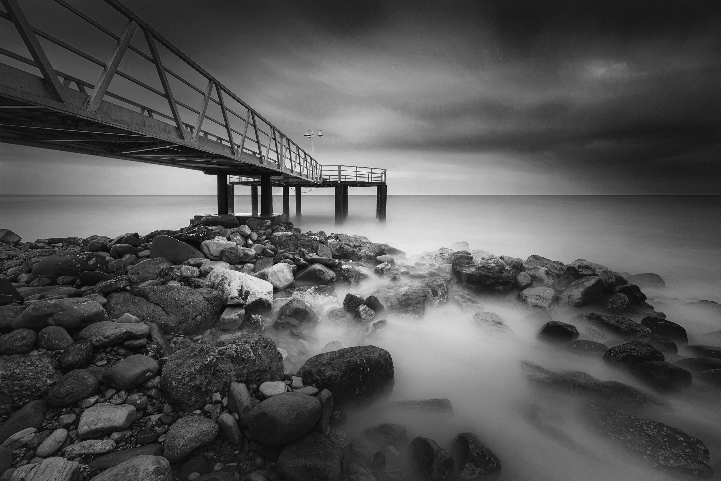
An image where color holds strong useful information such as color separation and contrast is very likely not a good choice for black and white. If visual interest in an image relies heavily on color, converting to black and white will only subtract information and debilitate the composition.
An example where color plays an important role could be one where complementary colors help balance the image or create contrast. In a case where visual excitement is orchestrated by a split-complementary color scheme, color holds too much of an important place in the photograph. Sometimes color can bring about interesting patterns. In these cases, the absence of color would produce no added value to the composition, thus providing no extra meaning.
Hence, only if you feel that color adds no value to the image and is subtracting interest from the main subjects or is distracting the viewer from focusing on the shapes, geometry and the composition of the image, then you may very well have a candidate for black and white.
Good Light.
Dramatization
On the other hand, black and white photography allows us to push our images a bit over what is real, allowing us to be a little more expressive and create more dramatic scenes that remain aesthetically acceptable, yet more invigorating.
As long as we are careful keeping a reasonable dynamic range in the luminosity of our image, and meticulous about not losing detail in shadows nor clipping highlights, we can narrate our story and exaggerate atmosphere by making shadows darker and highlights a bit brighter.
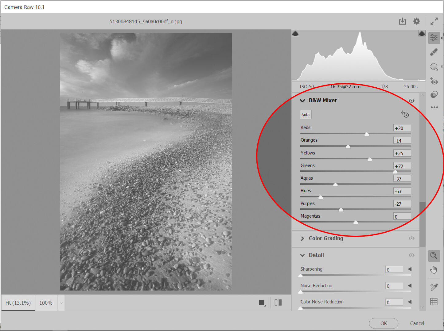
The importance of color in black and white images.
When converting a color image to black and white we should consider which colors define the lights and which the darks. This awareness will simplify adjustments in luminosity and saturation in the color to gray scale correspondence.
The “b&w mixer” panel in Camera Raw and Lightroom provide controls where adjustments to luminosity can easily be made. The complete color ranges can be adjusted here: reds, oranges, yellows, greens, aquas, blues, purples and magentas.